Tuesday, August 13, 2013

Our Little Ladybug Turns 1!

About a month ago, we celebrated my daughter’s first birthday!  I cannot believe how fast this first year has gone by!  The day could not have been more perfect, it was a bit windy, but it was warm and sunny and that was enough to please me!

My sister was my biggest help in planning this party!  I keep telling her that she needs to open a party planning business, but of course she wont listen to me.  Anyways, I spent the last few months deciding on the perfect theme for the big bash.  I knew the party was going to be outdoors and wanted a theme to go with the setting.  So after scouring through hundreds of Pinterest pictures and other blogs I finally found the perfect theme...LADYBUGS, and I had a great idea for the invites!

 Now normally everything I do is digital (I have zero patience for crafts), but for this party I made an exception.  Each ladybug body was hand cut and then assembled onto a card stock invitation.  In the beginning I was really nervous that the final product would look like a third grade art project, but was pleasantly surprised how good they looked when all was said and done!  I finished off the invitation with a bright red envelope a fancy wrap label (love them!) and a thank you card to match! {For a tutorial on these invites click here}

invitesFull

I rented out a local park shelter for the location, and then drove straight to Hobby Lobby to buy up everything ladybug-ish I could find to decorate!  The main colors were red, black and white with pops of yellow and green added in for more of a summer look.  It turned out great!

Decorations

Next came the food.  We did a grill out for everyone and then had cupcakes for the guests and an 8 inch smash cake for the birthday girl!  I ordered grass green cupcakes with little ladybugs and a simple, white smash cake with red piping.  I then found a lady on Etsy to design a custom cake banner!

CakeFull

We had an incredible turnout of family and friends and we felt so incredibly blessed to have our little girl surrounded with so much love and support on her big day!  

GuestsFull

The girl is 100% spoiled rotten!  There is no doubt about it!  She received tons of new toys and clothes for her birthday, more toys and clothes than we know what to do with!

DecorationsFull

Thank you to everyone who came, celebrated, and wished our little lady well on her 1st birthday.  Even though she may not remember it, the pictures/videos and memories we will most definitely share with her someday as a reminder of the amazing people she has in her life!

Photography by Alisha & Julie Photography
Ladybug Dress: Dillards
Ladybug Bib: A Baby Notion
Cake Topper: Especially Paper
Cake/Cupcakes: Bevs Cakes
Picture Banner: DIY 
Ladybug Frame: DIY 
Flower Pots: IKEA & DIY


Chalkboard Birthday Invite

I’m back!  I did not mean to go 2+ weeks without blogging, but it’s been a pretty crazy couple of weeks around my house!  Perhaps I will divulge some details later, but for now I want to talk about the fabulous birthday party I attended a couple of weeks ago to celebrate my baby cousin, Gabriele’s first birthday!
Aside from my own daughter, I can’t think of a sweeter, loving, more precious little girl than Gabriele, and I was thrilled when her mom, Mychele asked me to help design her party invite!
Those of you (like me) who spend countless hours surfing Pinterest would know that chalkboards are a hot trend right now, a trend that I’ve become slightly obsessed with!  I will be the first to admit I am not at all talented with actual chalk.  In fact, I have terrible handwriting, which is why for the past few months I had been dying to design a chalkboard invite, no handwriting required!
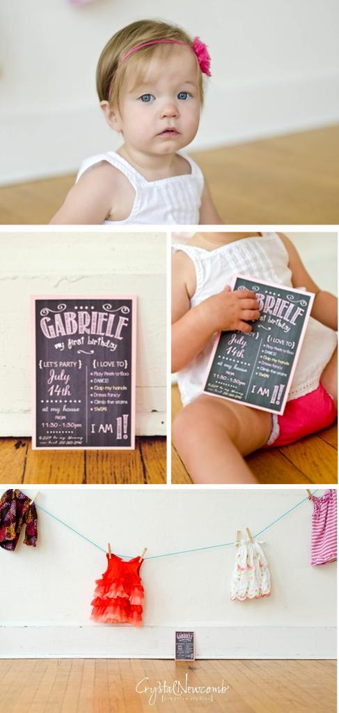
G1
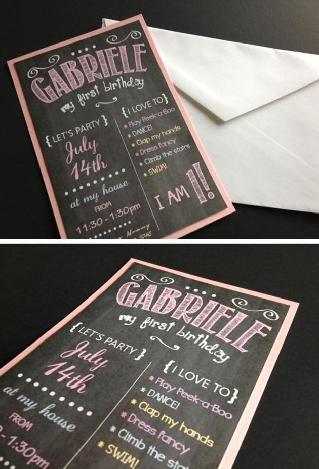
Gabriele’s party theme was “A Year in A Flash”.  I used a chalkboard invite to sum up the details of her party by creating a blackboard background and then backing it to a rose pink, metallic card stock.  I played around with fonts until I found a few that looked just like what you'd see on a chalkboard!   I then added a list of a few of Gabriele's favorite things along with some of the the milestones she’d hit throughout the year to tie the invite in with the theme!
Chalkbaord Invitation
Chalkboard Invitation
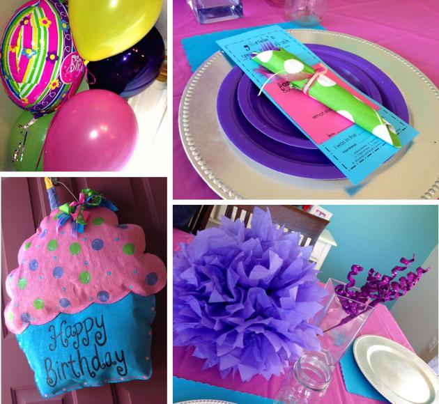
It was an awesome party!  The entire house was decorated in blues, pinks and purples…check out some of these adorable decorations!
G3
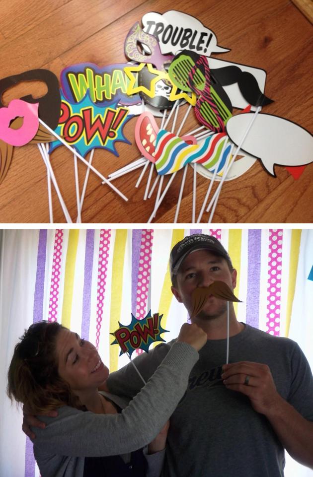
There was even a photo booth!  So much fun!
G4
I can't wait to see what Mychele has up her sleeve for next year's party! :)
A special thanks to Crystal Newcomb Creative Studios for taking some great shots of my invitations and of Gabriele!

A Fabulous Florida Wedding

There are so many incredible things to say about Mark and Mianne’s wedding that I am not even sure where to begin!
Mianne grew up here in Central Iowa, but after college, left to pursue a career in Tampa, Florida.  When we spoke on the phone last fall she mentioned that she had seen my work via Facebook and was hoping I could create her invites as a way of adding a little “hometown touch” to her Florida wedding.  I, of course, was more than happy to do so!
Some of my favorite brides to work with are the out of the box thinkers, and Mianne certainly fit the bill. She described her wedding to me using the words, fun, laid back, modern, but also vintage.  While talking, she explained to me that she wanted something more than the usual, flat wedding invitation.  Instead, she wanted something a bit more eye catching and exciting.
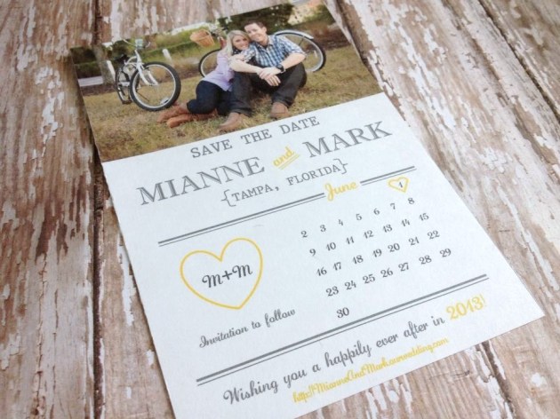
For me, the biggest challenge in doing what I do is designing something to fit perfectly with an event that has only been described to me in a short 30-40 minute conversation.  It then becomes increasingly challenging when you look at it from the perspective that what I am designing gives the first, real glimpse into a bride’s big day, a glimpse I want to make sure I get right.  So, with Mianne’s help, I set out to design the first piece of their wedding stationery suite, the save the date.
std2
Calendar style, with a vintage touch. 
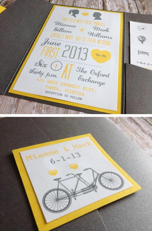
Next, her invitations...
inviteblog
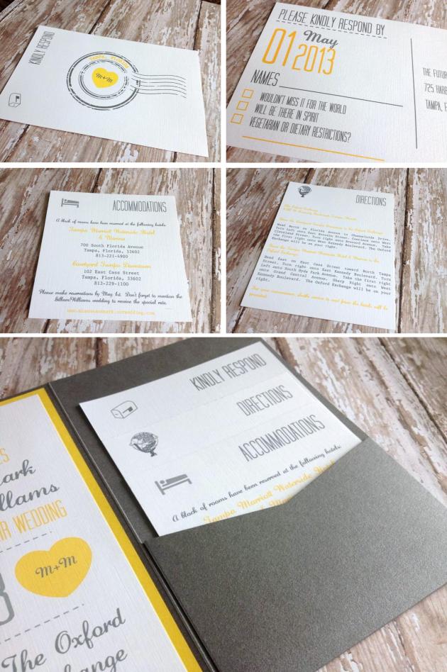
Bright and cheery with a clean, vintage feel.
cards
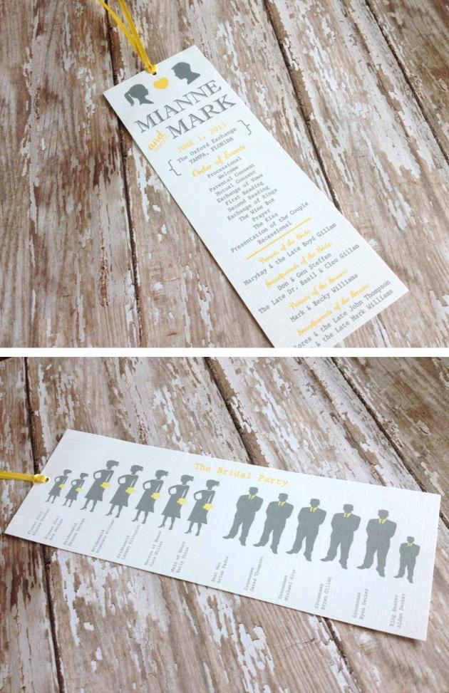
The programs.  How adorable are these bookmarks?...
programs
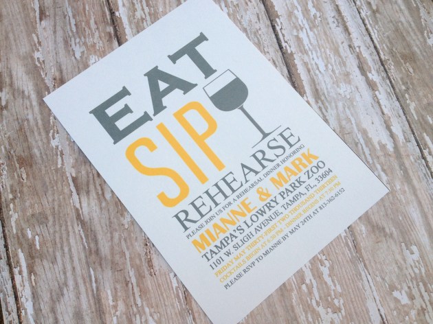
Rehearsal Dinner Invites...
IMG_2259
Eat. Sip. Rehearse.  Enough said, right?  Love it!
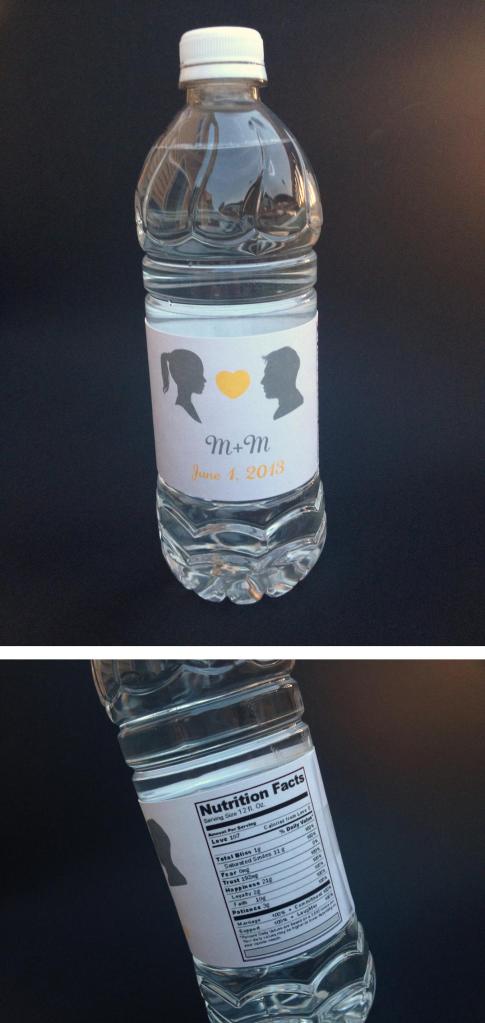
The water bottles...
water bottle
 Elements taken throughout her invitation suite were used to create these cute labels, a fun way to keep guests hydrated.
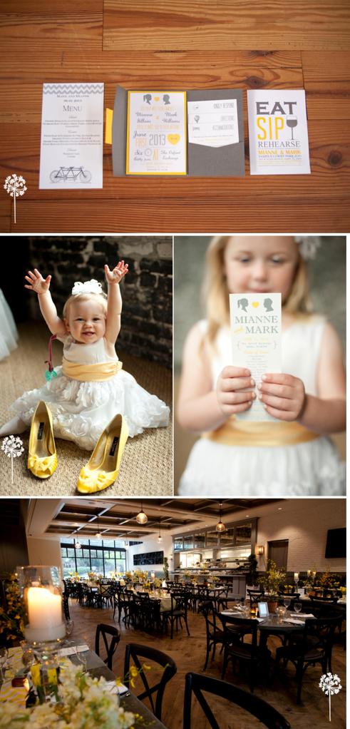
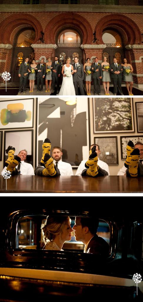
The couple was married at the gorgeous Oxford Exchange in Tampa, Florida and I have to say, I am in love with the way every single element of this wedding came together.  I knew from the very beginning that Mianne and Mark’s wedding would be fabulous, but I had absolutely no idea it was going to be this fabulous!  I am pretty sure my husband had to help me pick my jaw up off the floor after seeing a few of these pictures shot by Florida photographer, Stephanie Smith.  I owe a big thank you to Stephanie for taking some great shots of my work!
smith1
smith2
I also want to say thank you to Mianne and Mark for allowing me to help be a part of their big day, they were both absolutely wonderful to work with and I wish them the very best!

Megan & Joe

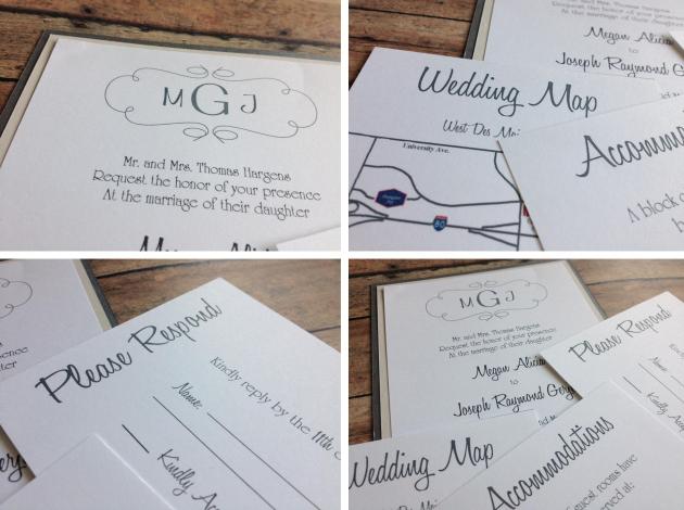
Earlier this spring I met Megan and Joe, a fun, energetic couple excited about their upcoming wedding. Megan and Joe came to me requesting a simple invitation suite to coordinate with their gray and white themed wedding, which took place last month at the HyVee Conference Center in West Des Moines.
They chose to do a triple layered invitation using a steel gray metallic cardstock as the backing layer complemented by a second, light gray layer and finished with a white, linen invitation layer.
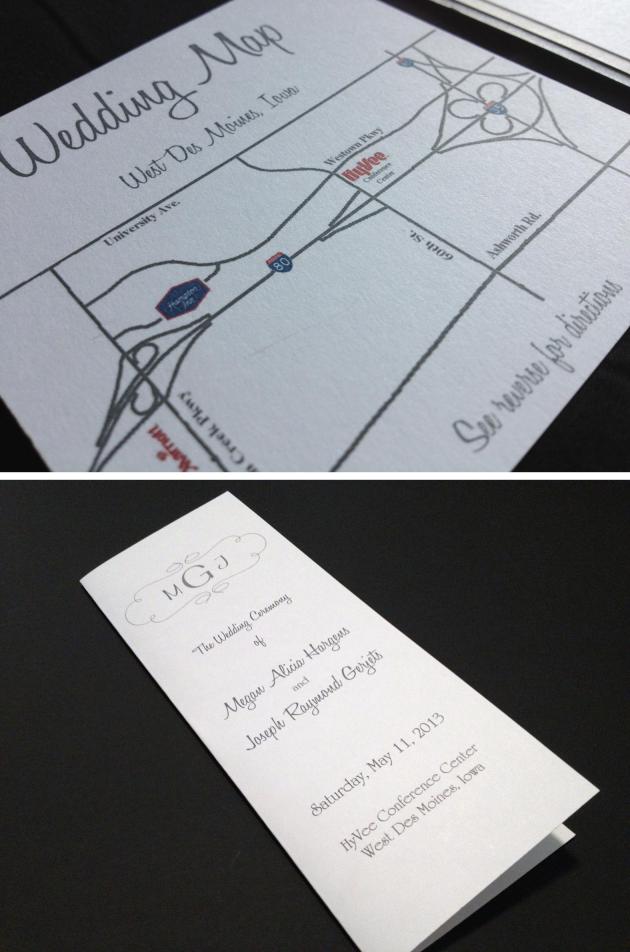
Megan and Joe also had me create a custom monogram to help tie all of the pieces together throughout their wedding.  The monogram was used throughout the suite and on their programs.
The invitation suite they chose also included three enclosure cards.  An RSVP in the form of a postcard, a reception card, and a custom designed wedding map!
mj2
MG3
Megan and Joe, if you’re reading this, I just want to say thanks, you were a pleasure to work with!

An Intimate East Coast Wedding

In my opinion there is certainly something to be said about a small wedding.  At times, there is no need for a plethora of decorations, a guest list a mile long, or a large wedding party piled into the biggest limo one can find to have a gorgeous wedding.
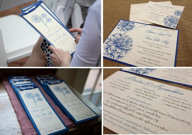
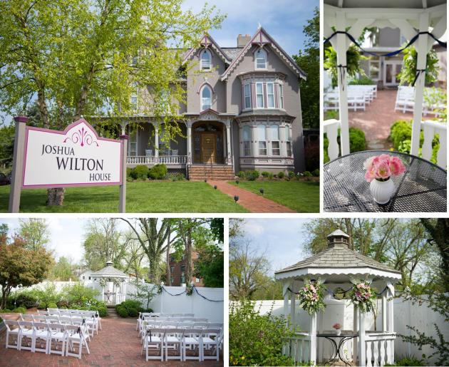
This past winter I had the pleasure of working with Shannon and Tom on their wedding invitations and programs.  As Shannon described her wedding to me via our first phone call I instantly understood that everything about this wedding was meaningful.  Shannon’s wedding colors were blue and white, with lots of flowers and a vintage touch.  The ceremony and reception was held on the back patio of the gorgeous Joshua Wilton House, a bed and breakfast in Harrisonburg, Virginia, and also the location of the couple’s first trip together.
63
The wedding turned out beautiful and proved to me that sometimes all you need is a meaningful setting, the people you are closest to and the person you love to have a gorgeous wedding day!
61
62
Thanks so much to Mike Miriello of Miriello Photography for allowing me to use some of the photos he took to help capture Shannon and Tom’s big day!

A Few Design Finds

Post #3!  I've been thinking a lot lately about the direction I want to take this blog.  Of course I want to use it as a platform to share my latest designs, but I also want to use it to share the latest styles in wedding trends, party trends and other unique design finds from around the internet.  I thought I'd start by sharing a few of my latest online design obessions with you.
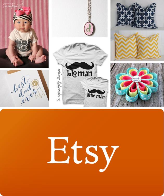
Etsy:  Don’t even get me started!  If I had a million dollars, I honestly think I could spend it all on this website in about an hour!  From home goods, to paper goods, to baby bows, you name it, Esty has it!
510
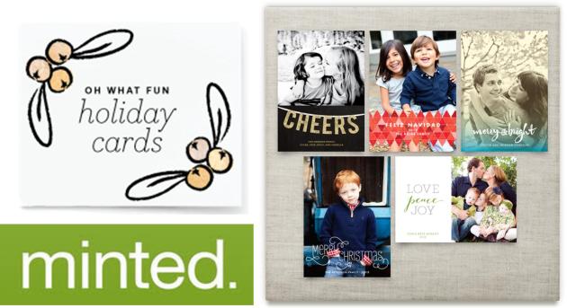
Minted: A graphic designer’s heaven!  This website features a new “design challenge” every few weeks open to any graphic designer (me!) who may be interested.  Other designers then vote on their favorites and the winner gets their design sold on the website, pretty cool!  Their current challenge is holiday theme, Christmas in June anyone?
m5
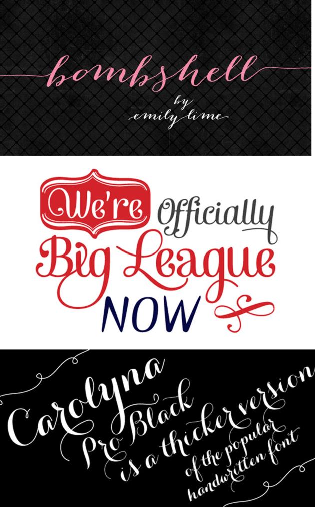
DaFont.com: I could spend HOURS searching through this site and downloading (for free may I add) all my favorites.  Bombshell Pro = my current fave!
f
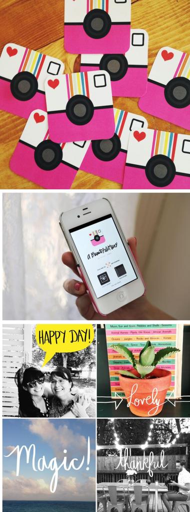
Photography:  My biggest guilty pleasure.  In my sparetime I would much rather log onto my laptop and Google the work of random photographers I don’t even know then catch up on the 15+ shows I have waiting for me on my DVR.  I love studying the different editing styles of each photographer, getting a chuckle out of the props they use, and awing over the adorable style you see on their blogs.  I will be the first to admit that I take all my photos with my iphone (yikes, I know), but I am slowly learning the “rules” of blogging and realize that in order to run a successful blog, you need to take quality photos.  Sadly, at this point, my Photoshop skills are quite minimal (i'm s.l.o.w.l.y teaching myself), which is why when I stumbled across this new app the other night I got SUPER excited!   This app, A Beautiful Mess, allows you to easily add cutesy little doodles, borders and text to your own photos, making them feel a bit more professional…I love!
abm4

Designing for a good cause

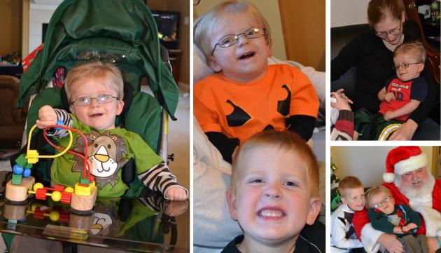
I’d like you to meet Jonathan Lockie and his wonderful family.   I’ve had the pleasure of meeting Jonathan a number of times and can easily say that he is the bravest two year-old I’ve ever met!  Jonathan was born with a rare heart defect known in the medical world as Hypoplastic Right Heart Syndrome, along with a list of other heart defects - essentially half a heart.  At just six days old Jonathan was facing open heart surgery, ultimately leading to months in the hospital.  One day while doing some research on the internet, Jonathan’s mom, Sara, stumbled across an article about a simple screening known as pulse oximetry screenings for critical congenital heart disease (CCHD).  She learned that many seemingly healthy newborns are sent home from the hospital undiagnosed with this disease and are at a very high risk of death or disability because of it.  What’s even more alarming is that this disease can be prevented with a simple test that is noninvasive, inexpensive and can easily be added to the list of newborn screenings conducted in hospitals.  However, it is a test that unfortunately was not on the mandatory list of screenings in Iowa hospitals.
jonathan
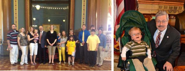
Since learning about Pulse Oximetry Screenings, the Lockies and other families across the State have been hard at work to ensure that all newborns in the State of Iowa have the opportunity to have their hearts screened.  Adding another mandatory newborn screening requires legislation or an administrative rule change through the State Board of Health.  Earlier this month the hard work of these families paid off, a bill for an act requiring critical congenital heart disease screening for newborns as part of the state's newborn screening panel was passed by the House and Senate and is currently awaiting the governor’s signature!
Branstad
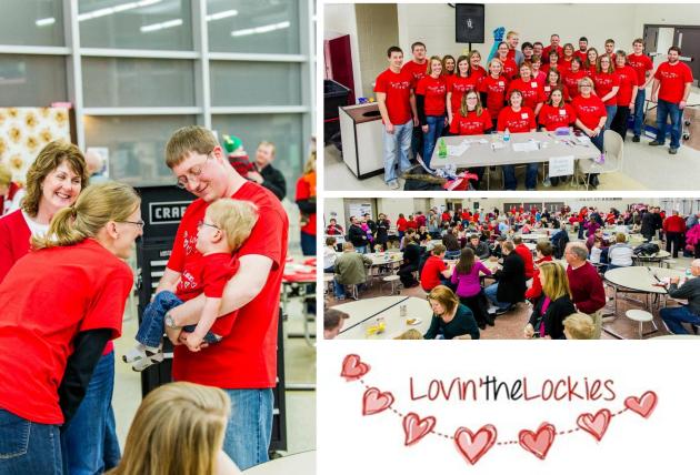
So how does this story relate to my invitation business you ask?  Well, back in January, I learned of a silent auction for Jonathan and was asked to help create a logo for the fundraiser.  After asking how I could be of further assistance, I decided to donate an auction item in the form of 50 free invitations!  The fundraiser was a huge success and about a month later I received an email from Kelsey, the winner!
The Benefit
Kelsey had recently given birth to a little boy and was asking that I create his birth announcement.  Her request was simple, “something bright, cheery, cute and contemporary”.  She sent me a few pictures to choose from for the announcement, one of them being an adorable image of her little guy in a giraffe hat.  Once I saw the photo I couldn’t resist designing something around it!    I love designing and playing around with fonts and new ideas, but I have to admit, designing for a good cause like Jonathan’s fundraiser made it even more enjoyable!
kelsey
I ask that you please read more about CCHD and Jonathan’s brave journey on his mom’s blog, and in this article published in USA Today.  If you’re feeling generous and would like to support this adorable little boy and his family, donations may be directed to the Lockie Benefit account at Veridian Credit Union, 1201 S Ankeny Blvd., Ankeny, IA 50023.  Thank you!

The First Post!

To be honest, I'm not even sure where to begin.  I am excited (and nervous) to start this blog and share with all of you my passion for design.  For the past few months I've been hard at work on my new website, and I am happy to announce that after a few unsuccessful attempts it's finally come together the way I envisioned.   Along with the website, I am also revamping my Facebook page.  I know that Facebook and other social media outlets (like this blog) are some of the best ways to advertise and grow a new business.  So far I have been fortunate enough to simply rely on word of mouth to meet new clients, which has allowed me the opportunity to work with some wonderful people and create one of a kind invitations to help make their events as memorable as possible.  Please keep checking back for updated photos of my work, event tips and ideas, inspiration and much more!
Post 1